Argus Farm Stop
About
Argus Farm Stop is a cafe and grocery store based in Ann Arbor that aims to support and connect its local agriculture and community. For this project I was tasked to revamp the company's branding in celebration of its 10 year anniversary. The goal for the rebrand was to make the branding more cohesive and modern, while still drawing from the original aesthetic and mission of the company. My rebranding proposal includes design elements, a simplified logo, an alternative logo, a 10 year mascot, and applications for all these designs.


Design Elements
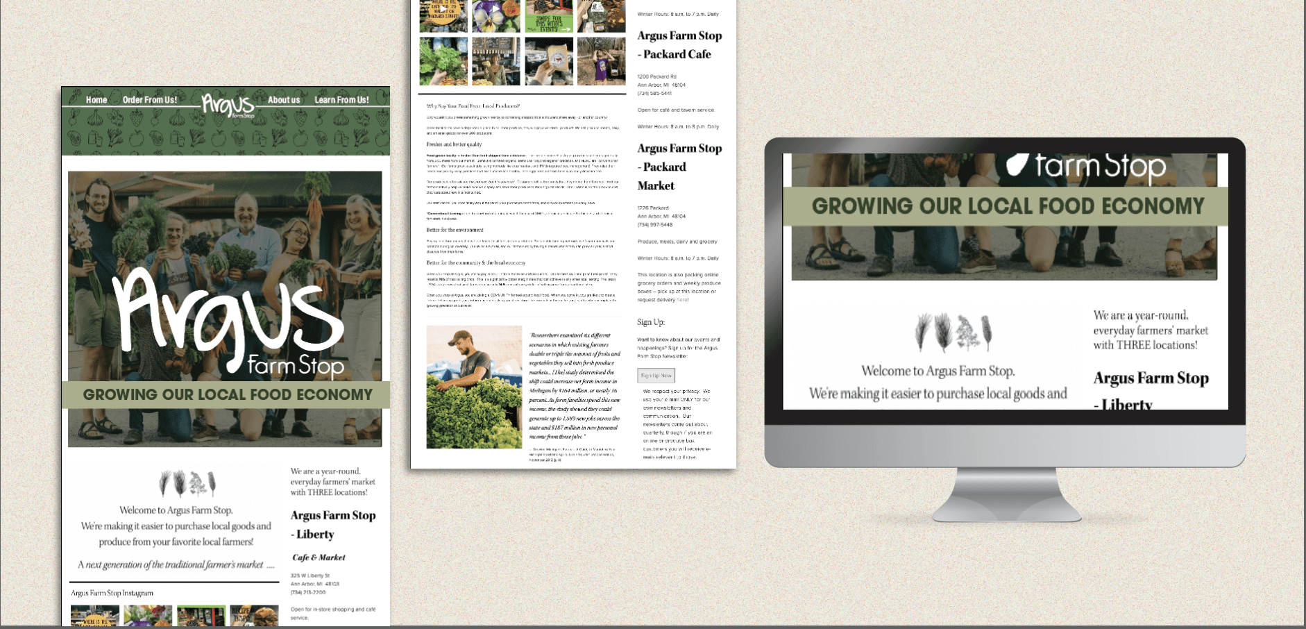
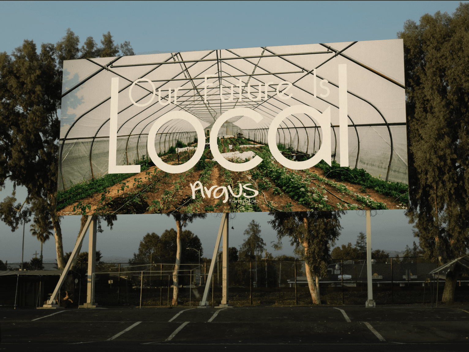
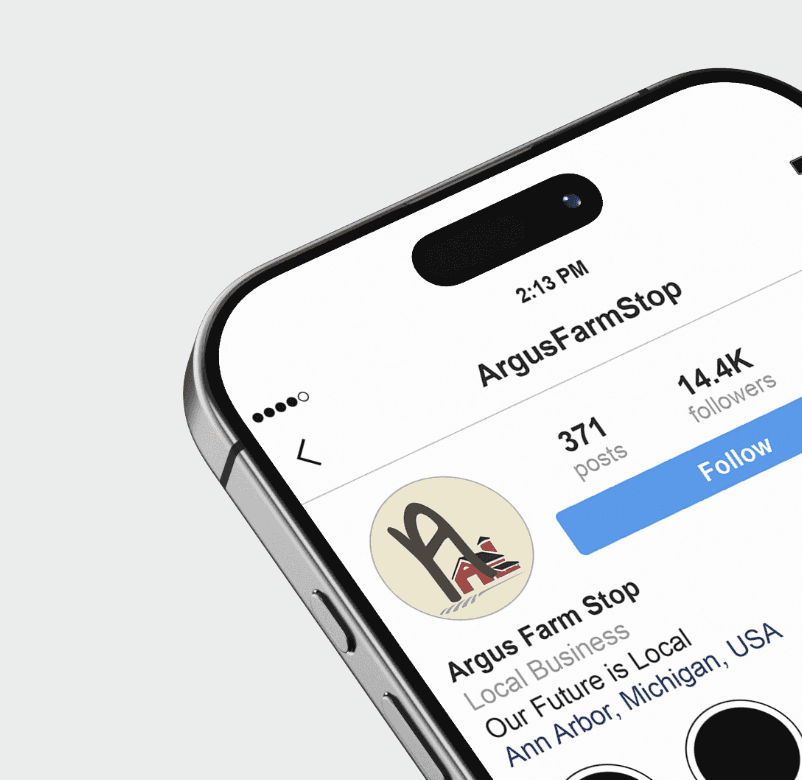
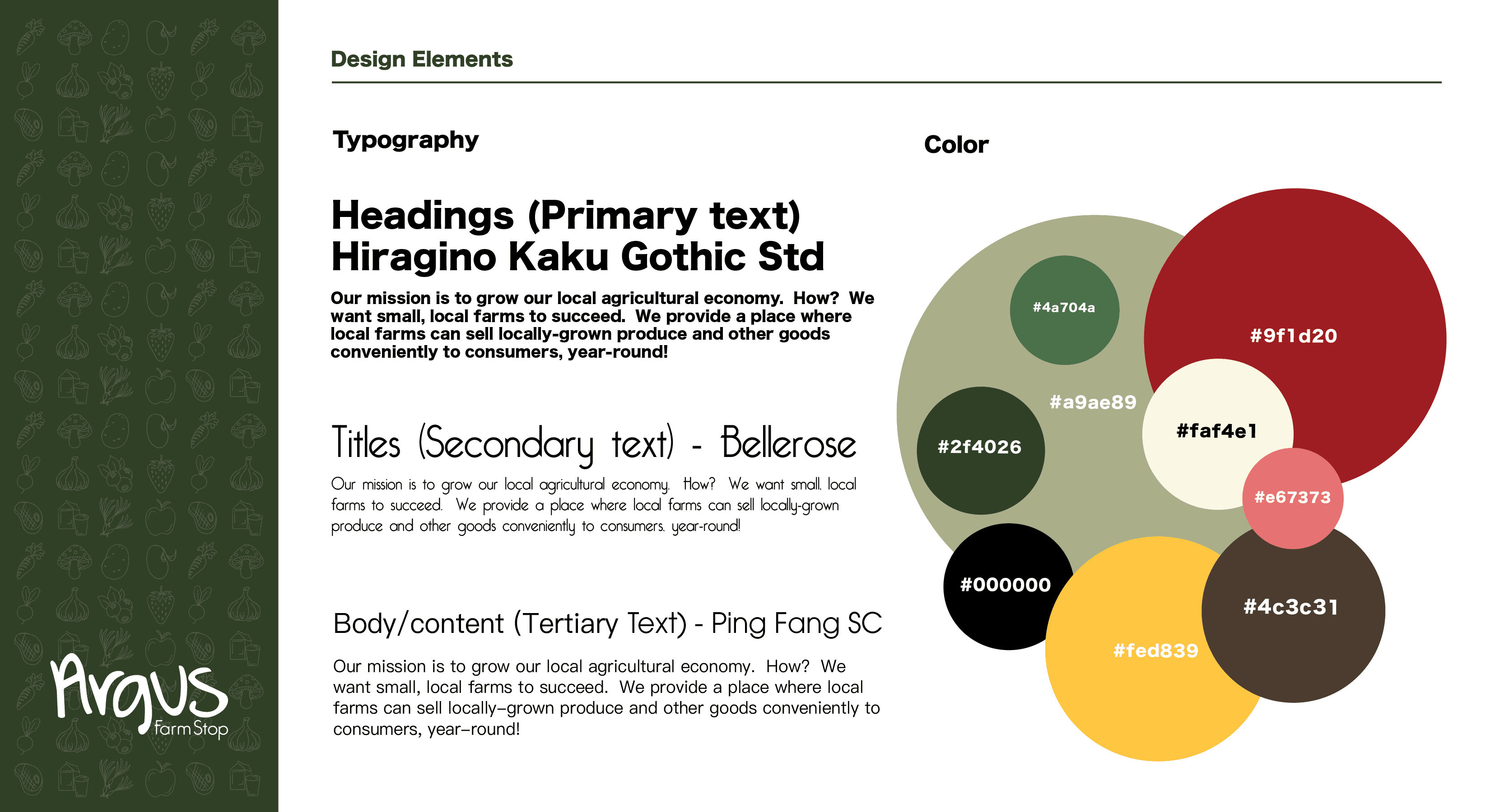
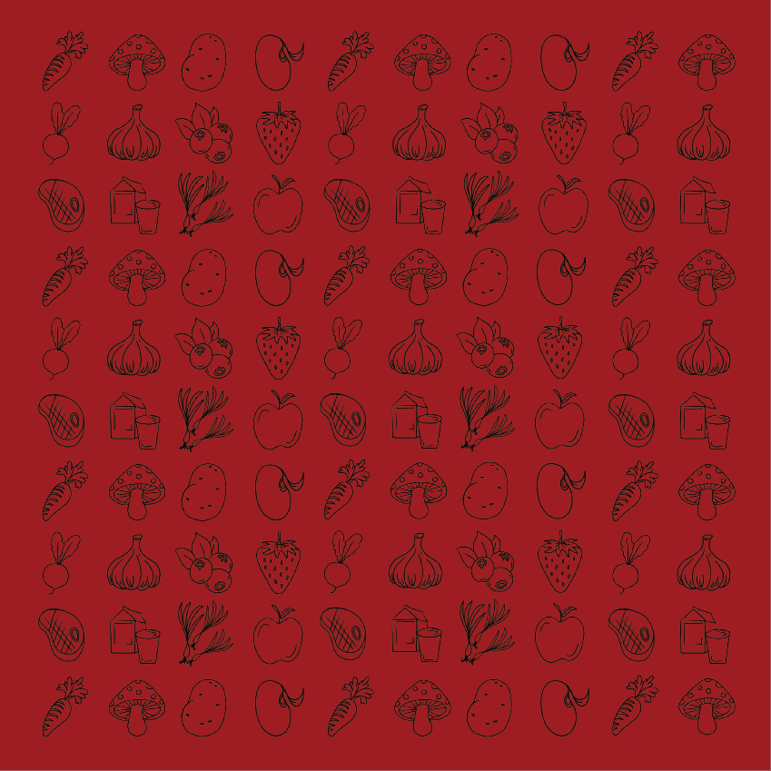
The Design elements include curating a standard set of colors and typography for the brand to implement. These would be used across all communications and branding, including merchandize, signages, stationary, and more. I also created a repeating wallpaper with hand-drawn icons to match the aesthetic of the brand while providing an element to be used across usages. Below is a summary of the design curation as well as a showcase of the applications.


Simplified and
Alternative logos
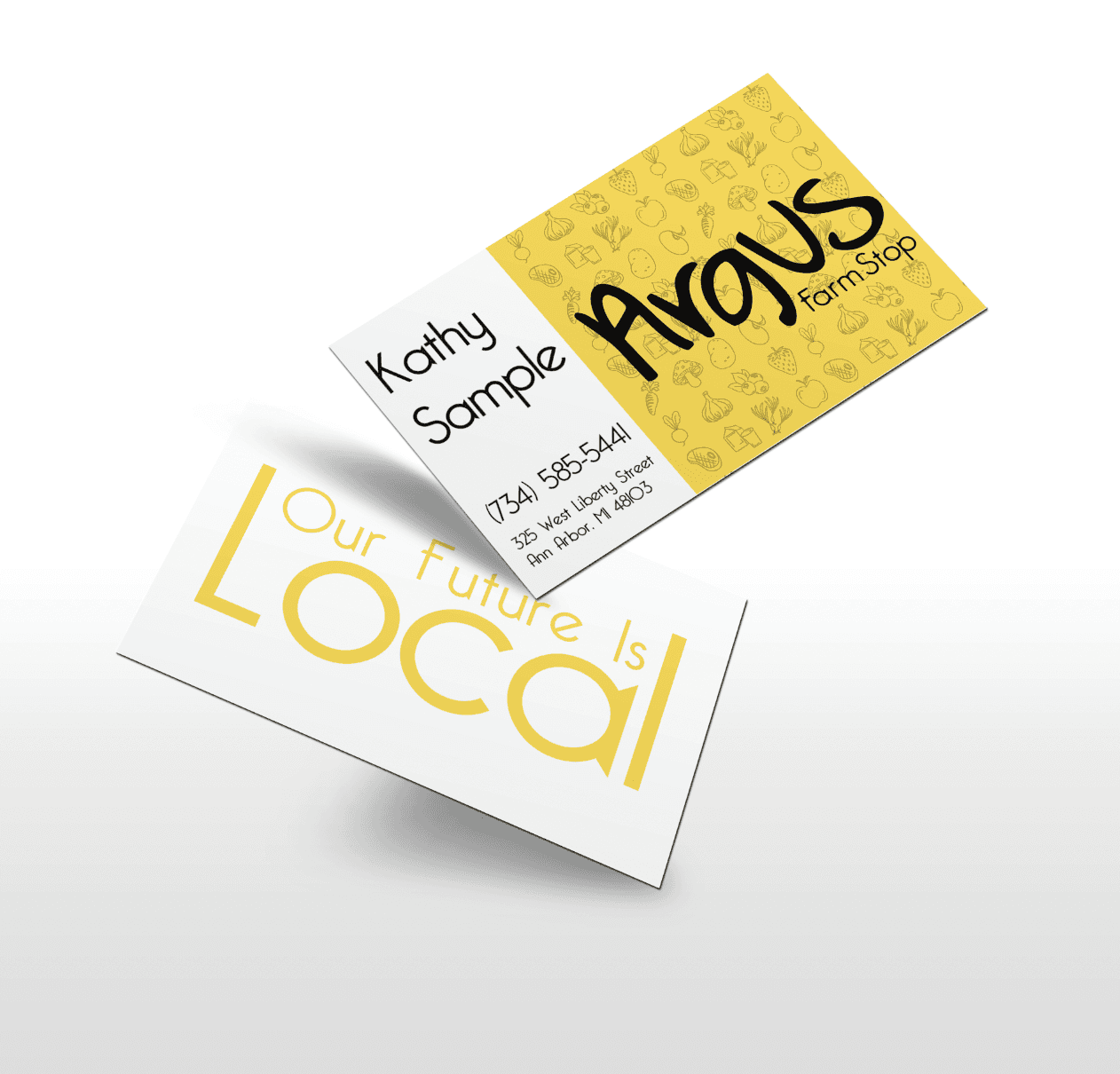
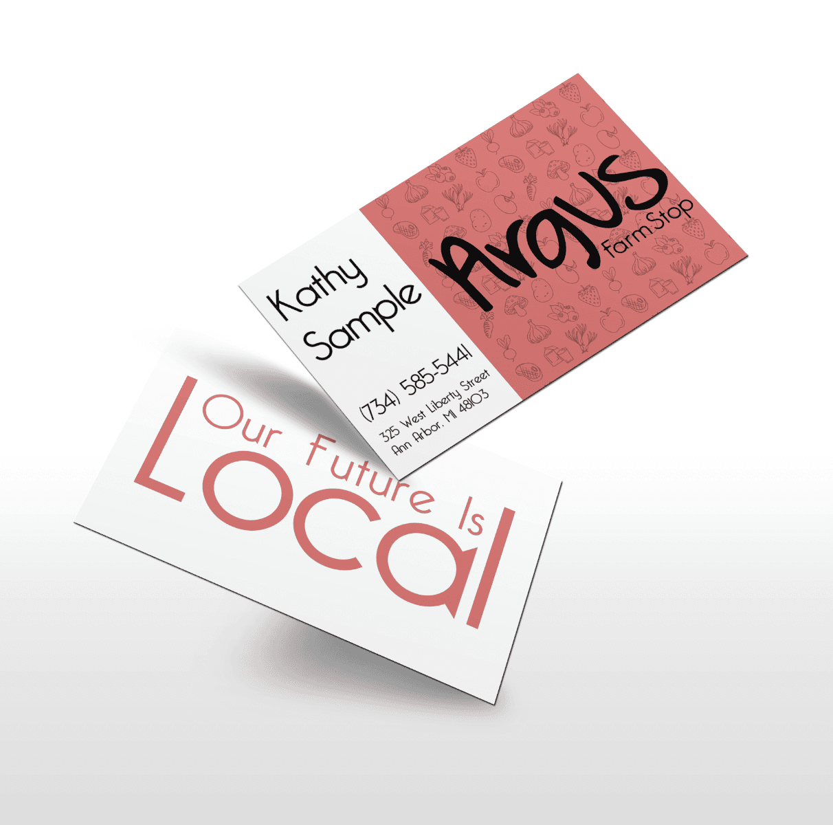
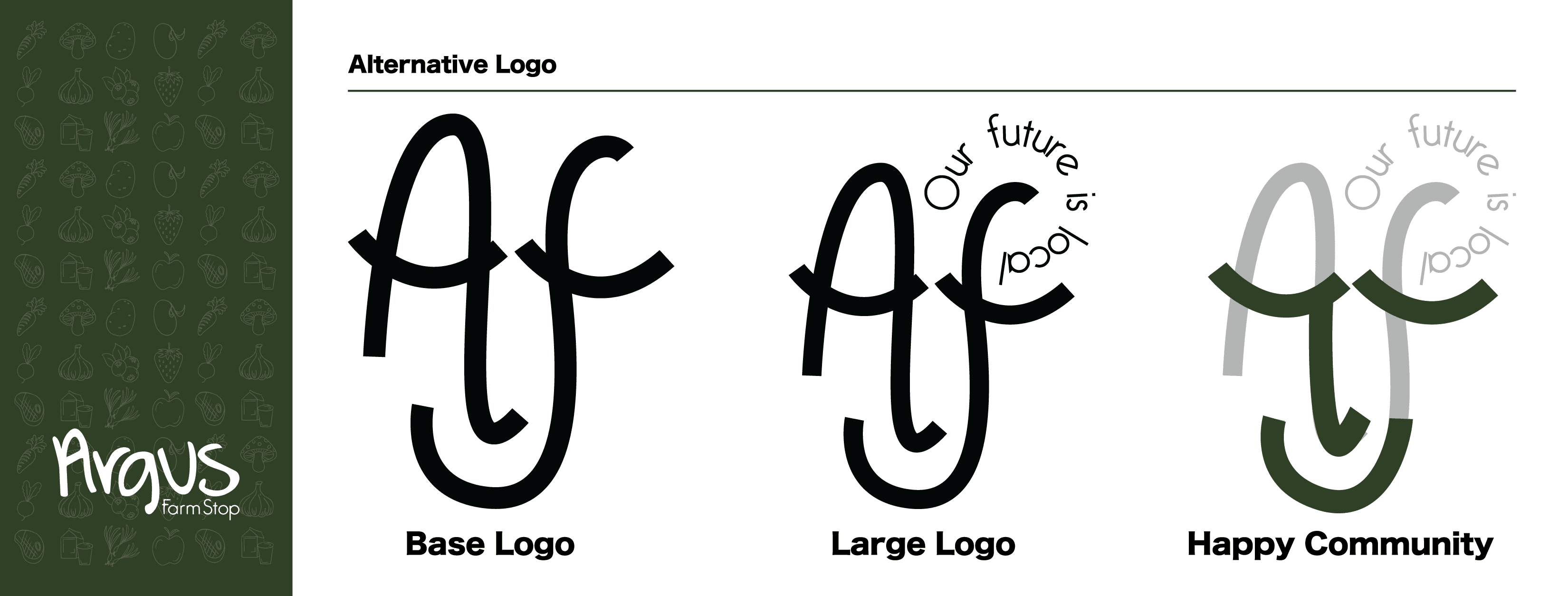
One of Argus's requests was to provide a smaller, shortened version of their logo as they found the use of their main logo difficult/ illegible in smaller uses. In doing so, they also hoped for this to represent an updated logo. I also provided an alternative logo to suggest a new concept revolving more around the community and customer happiness aspect of the brand. Both the simplified logo and alternate logo are featured below with a showcase of applications.


I designed two mascots for Argus to use in celebration of their 10 year anniversary. The apples are inspired by Argus's base color pallete and the bunny is in celebration of Spring and new beginning, which is the season during which the anniversary occured. Below are depictions of the mascots and a showcase of them in use.


